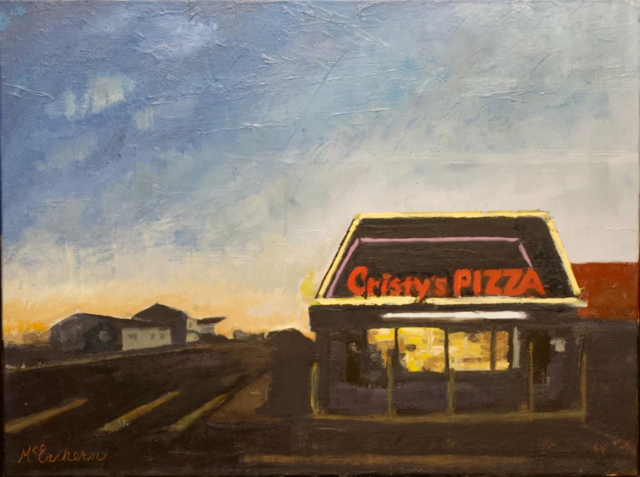
While studying oil painting techniques, I found color saturation fascinating. Though some may find it dull, I get excited about topics many overlook. Color saturation in painting is powerful and important, and it fuels a long learning journey.
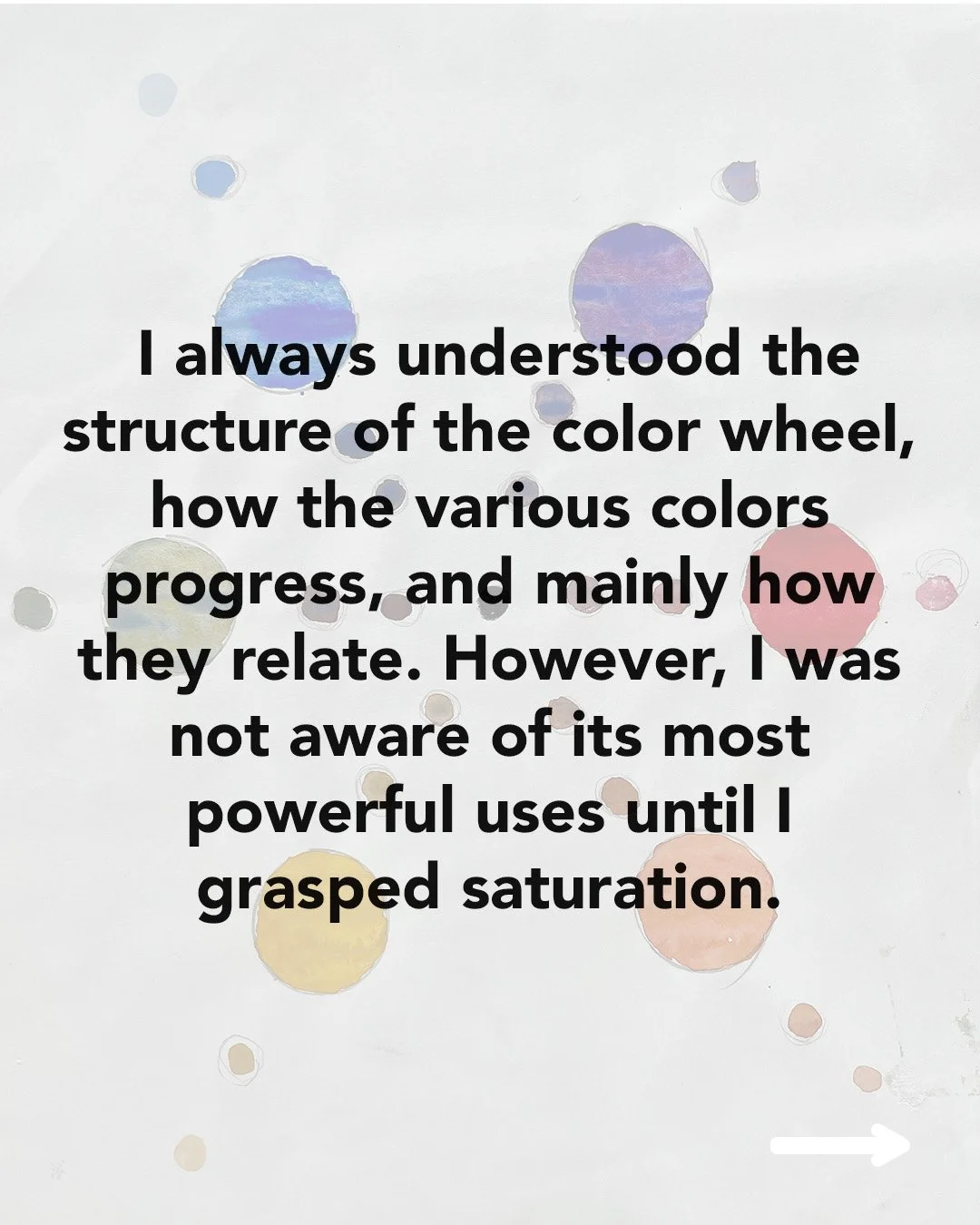
When learning to create artwork, the color wheel is always a mini-project required by instructors early in their curricula. Open any how-to painting book or start any art class, and creating a color wheel is right there. I always understood the structure of this tool, how the various colors in the wheel progress, and mainly how they relate. However, I was not aware of its most powerful uses until I grasped the concept of saturation.
Color saturation refers to the intensity or purity of a color—how vibrant or muted it appears. A red with high saturation is bright and vibrant, while a low-saturation red is dull, approaching grey. When any color is completely desaturated, it approaches grey.
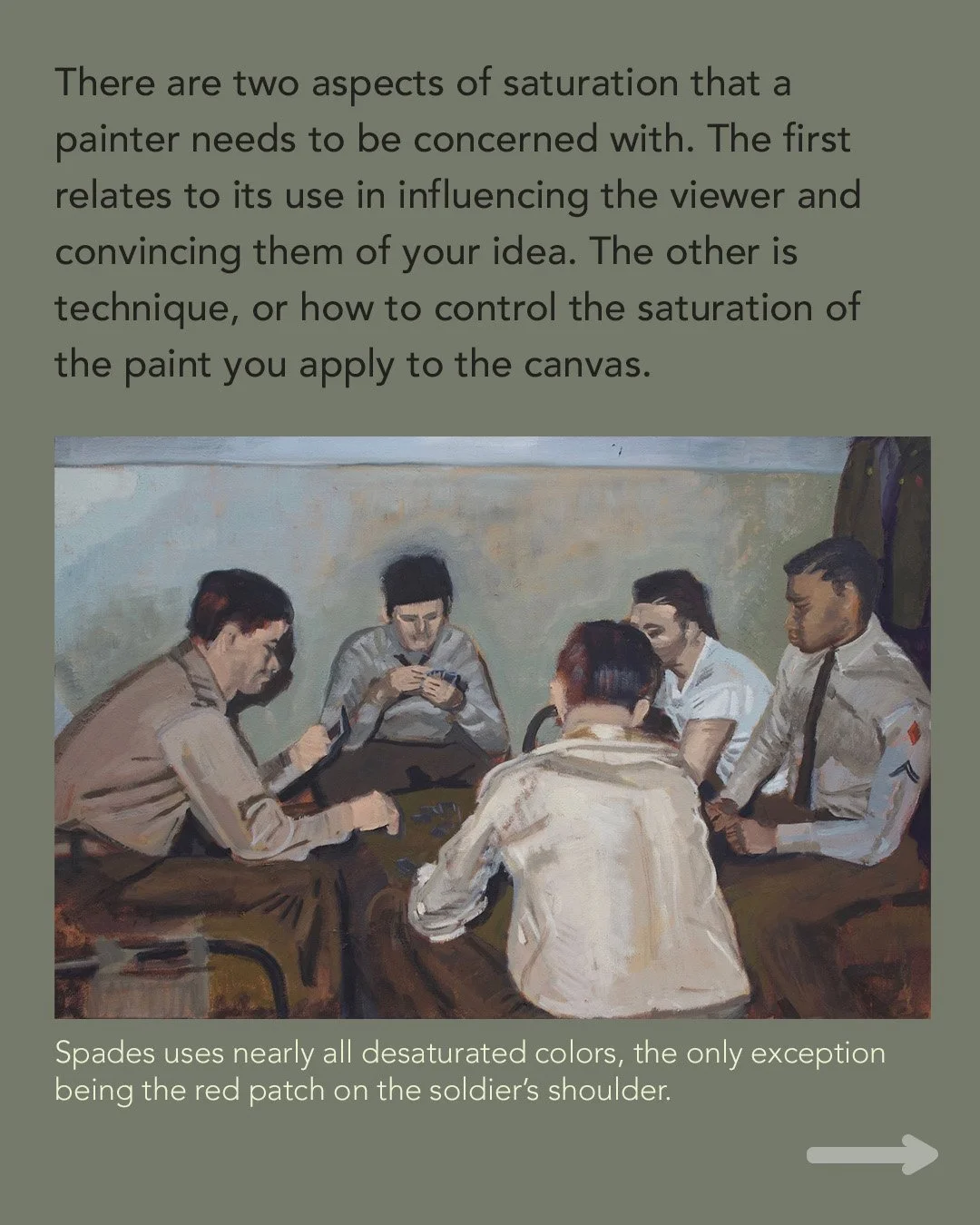
There are two aspects of saturation that a painter needs to consider. The first relates to influencing the viewer and convincing them of your idea. Here, you are always trying to convey structure, depth, and ultimately, tell a story and evoke emotion. To achieve this, manipulating color vibrance across a canvas is one of many tools available. For example, an object you want to be perceived as distant should be less saturated, with less color. Similarly, elements intended to appear in shadow would also be less saturated.
This is not some rule that artists have agreed upon and created. It instead reflects how humans perceive and process color, based on light physics and the way our retinas work. It’s very sophisticated stuff, and the artist needs to find a way to work with ease in this physics framework.
The other important aspect for the artist is technique, or controlling the saturation of paint on the canvas, which is directly tied to color mixing. Paints straight from the tube can be placed on a color wheel by hue, depending on their relationship to the three primary colors.
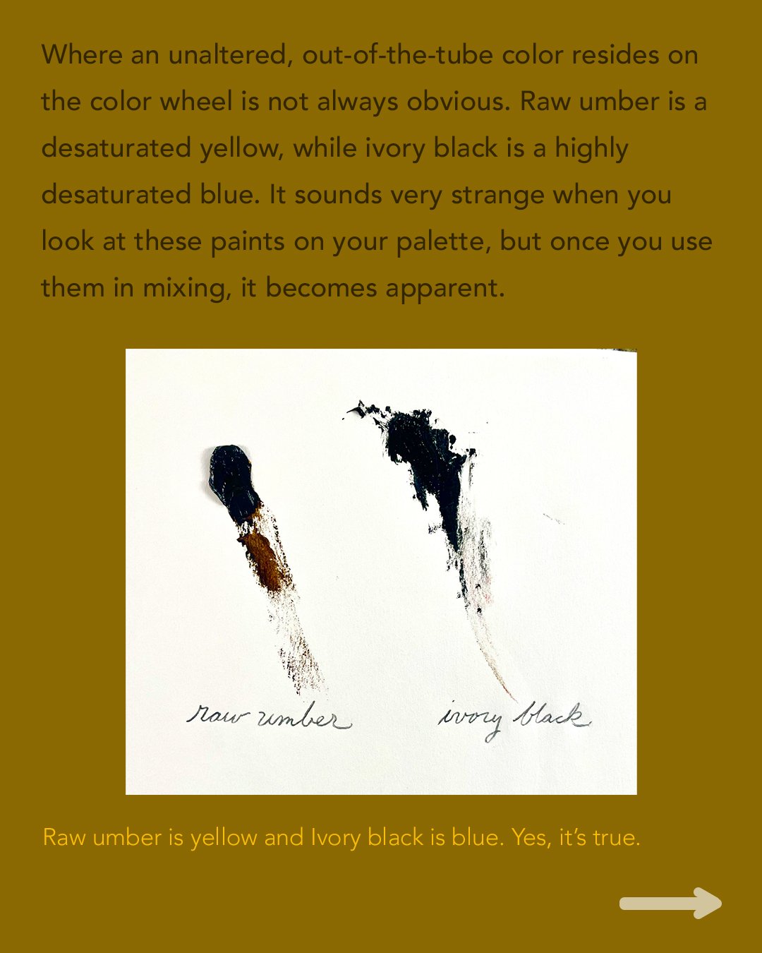
Where an unaltered, out-of-the-tube color resides on the color wheel is not always obvious. Raw umber and ivory black are great examples of this. Raw umber is a desaturated yellow, while ivory black is a highly desaturated blue. It sounds very strange when you look at these paints on your palette, but once you mix them, it becomes apparent.
We all know that blue and yellow mix to create green. If we mix ivory black with a bright yellow, we get a paint mix that is a very murky green, and not really a murky yellow. The blue from the ivory black is making itself known.
Raw umber straight from the tube does not resemble yellow to the untrained eye. It is a dull, uninteresting brown. However, if it is mixed with a bright blue, the yellow will once again be revealed, as the resulting mix is closer to green.
There are two main methods to desaturate a color: add grey, or mix in the complementary color (the one opposite on the color wheel). I generally prefer the complementary method because it produces more visually compelling, dynamic results. To use this approach effectively, you need to precisely identify the color positioning of your paint tubes on the color wheel.
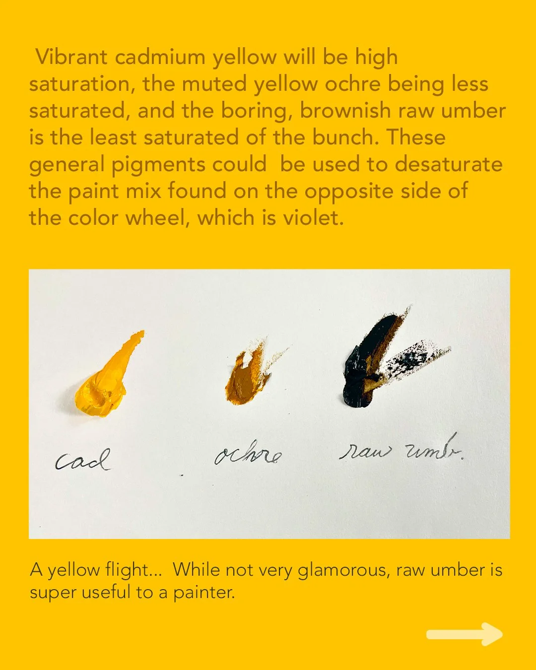
A vibrant cadmium yellow will be high saturation, the muted yellow ochre will be less saturated, and the boring, brownish raw umber is the least saturated of the bunch. These general pigments would be used to desaturate the paint mix found on the opposite side of the color wheel, which is violet. So if there were a purplish object you wanted to convey to the viewer, as in shadow or in the distance, you would consider adding yellow to the mix. The super-powerful raw umber, which seems like Dullsville, is often a great choice for this.
I remember when I was starting out, burnt umber and raw umber were always added to the palette—I thought, 'Ugh, how boring.' Why do these uninteresting colors keep showing up? It’s because they are very effective for pulling out color. You very rarely use paint straight out of the tube—it's too much, and it doesn't reflect our world. You need to pull it back into something more useful and convincing.
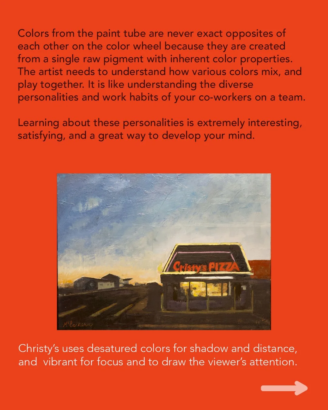
Understanding the concept of saturation is straightforward, but the reality, as always in life, is more nuanced. Colors from the paint tube are never exact opposites of each other on the color wheel because they are created from a single raw pigment, which has inherent color properties. Therefore, the artist needs to understand how various colors mix, how they play together, and their strengths. It is like understanding the diverse personalities and work habits of your team members.
Learning about these personalities is extremely interesting, satisfying, and a great way to develop your mind.